
Orlando Health
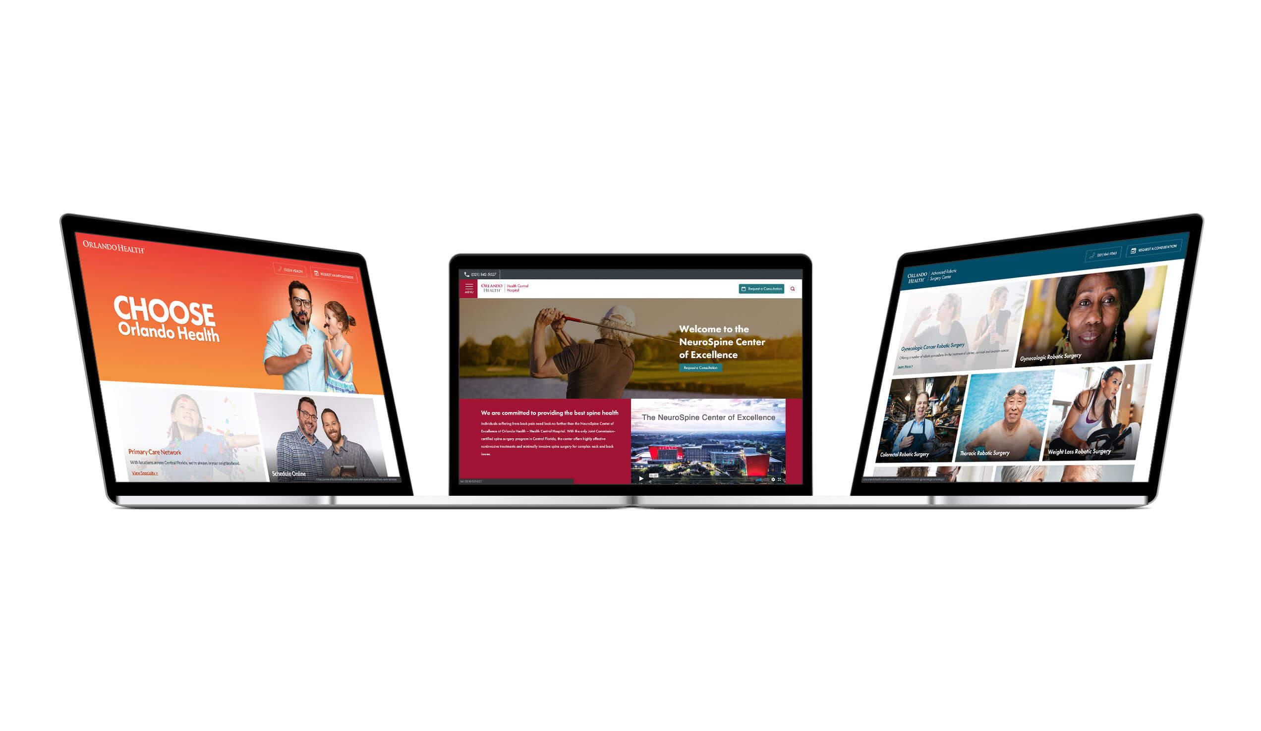
Orlando Health is a $3.4 billion not-for-profit healthcare organization and a community-based network of hospitals, physician practices, and outpatient care centers across Central Florida. Rightpoint helped to create a standardized, compliant, and visually appealing set of microsite and campaign design components that would simplify and streamline content creation/publishing tasks, mitigate demand on finite technical resources, and reduce the time required to build and launch a landing page or microsite by 50 percent.
For an organization as robust and far reaching as Orlando Health, building and maintaining a digital presence comes with certain inevitable challenges. In this case, multiple teams within the organization were using a variety of content management tools and resources to build one-off microsites and campaign landing pages. As a result, there was uneven adherence to brand governance, a lack of visual consistency, and room to improve on accessibility. Operationally, the disparity between the workload and available internal resources made it difficult for the internal team to keep up with demands and take advantage of every business opportunity.
Ultimately, Orlando Health needed an efficient and flexible design solution (visual system and editor experience) that was tailored to their technology platform (Sitecore), WCAG 2.1 compliant, and able to meet the needs of multiple authors responsible for rapidly launching digital assets across Orlando Health’s portfolio of four brands.
To deliver such a solution, Rightpoint needed to apply an integrated range of capabilities to first fully assess the business and user needs and then create a comprehensive set of white labeled microsite/campaign components based on a sophisticated design system. Successfully making the complex simple in a way that served both the external and internal audiences would also require exacting design skills and in-depth technology expertise about the core platform.

Going into the project, Rightpoint was keenly aware of several key considerations and constraints. First, there were a number of direct and indirect stakeholders, each with their own concerns. The solution would need to deliver a beautifully designed and functional experience for the consumer audience. At the same time, internal resources needed a set of Sitecore-compatible tools that would allow them to stand up microsite and campaign landing pages more quickly and easily. Finally, organizational leadership wanted to achieve operational efficiencies in terms of both turn around time and cost savings as well as brand coherence and consistency across multiple properties and channels.
Through an in-depth audit of existing campaigns and microsites, the team created an inventory of visual design and content elements that included an overview of look-and-feel elements within the various UIs. The team identified commonalities, which in turn helped define a finite set of components that would offer extensive reusability across future initiatives. Finally, this initial phase also included development of a business requirements document and creative brief. Together, all these deliverables informed the establishment of standards and variations for the design phase.
Armed with the insights, the Rightpoint team moved into design, producing a series of “style tiles” to facilitate efficient buy-in on the new visual direction. Similar to moodboards, style tiles provide an effective way to illustrate conceptual direction with a focus on key design elements including color, type treatments, and interface patterns without the burden or distraction of a full page layout. Throughout the design phase, Rightpoint worked closely with Orlando Health’s brand and creative teams to ensure that the solution would adhere to brand standards without compromising the flexibility afforded to in-house designers. In addition, the team layered in their knowledge of the Sitecore platform design constraints and WCAG 2.1 accessibility requirements, building in failsafes to guarantee that the solution would be sustainable over the long term.


The final result of this digital transformation effort was a collection of 25 mix-and-match renderings that gave Orlando Health a flexible set of building blocks with built-in brand and accessibility-compliant themes. Having the ability to quickly and easily deploy these across Orlando Health’s portfolio of brands provided critical support to the organization’s cross-channel marketing efforts. The white labeled solution delivered improved efficiency, consistency, and accessibility while simultaneously enhancing the consumer/visitor and author/user experiences.
Research and Insight
Asset Audit and Analysis
Design System Development
User Experience Design
Design Taxonomy
Prototyping
Change Enablement
Sitecore

