
Iron Mountain
When the world’s leading storage and information management brand needed to transform their site experience, they knew Rightpoint’s expertise in reimagining corporate experience strategies would be key to their success. As a global leader in storage and information governance, serving more than 225,000 organizations around the world – including 95% of the Fortune 1000 – Iron Mountain felt a responsibility to deliver a best-in-class web experience aligned with their brand value. To support the mission, the Iron Mountain marketing team was embedded as direct collaborators in every aspect of the research, creative, and development phases of the work, from the most granular data analysis to site-wide architectural changes. With only eight months to complete discovery, design, and implementation, the pace was tight, but Rightpoint succeeded in delivering a completely transformed experience aligned with Iron Mountain’s strong growth strategy.
Iron Mountain’s market leadership position in storage and information management services is built on a venerable history going back more than seventy years, and which has earned them the trust of some of the best-known brands in the world. But Iron Mountain is never content to rest on past success. They are always striving to find new ways to push the boundaries of the industry and create a future-looking organization that can anticipate customer needs and deliver innovative solutions to elevate the power of customers' work.
To support their global growth strategy, Iron Mountain needed a world-class web presence that was flexible enough to easily scale across their portfolio of sixty international websites across the globe. There was a valuable opportunity to modernize the existing website to present a much more digital-forward aesthetic. The trick would be to reimagine the site design and content while staying true to the company’s rich history.
Other challenges included the fact that the site was built on an older version of Sitecore, which made it difficult to manage. In addition, the content and site structure were inconsistent, and did not accurately convey the full breadth of Iron Mountain’s services to prospective customers.
Overall, Iron Mountain was invested in elevating their entire brand presentation — from the visual design and information architecture down to every last piece of content. And they chose Rightpoint as their partner to bring this vision to life.

Right from the start, Iron Mountain was the epitome of an in-the-trenches partner with Rightpoint. They were involved at every step of the process, working side-by-side in the day-to-day strategy and execution. Their willingness to share ideas, learn from Rightpoint’s expertise, and collaborate on new approaches were instrumental in creating the ultimate success of the project, which encompassed two primary phases: Frame & Shape and Create.
Frame & Shape
Despite a very tight time frame of only a few weeks, the team embarked on an aggressive schedule of stakeholder discussion groups as well as assisting with a content audit, internal surveys, and some guerrilla testing of customer engagement using heat maps and other tactics.
The stakeholder discussion group process was both broad and deep. The team ran more than a half dozen groups to ensure coverage across all of Iron Mountain’s business lines and functions, and they spent the requisite time with each group to really dig into their needs and objectives, where they saw issues with the existing site, and where they saw opportunities.
One of the most exciting outcomes of this intense period of research was how deeply aligned the entire organization was around a common mission. Again and again, the discussion groups uncovered the same set of issues with the existing site and identified the same set of goals for the new site.
After years of being less than optimally managed, the existing site struggled in providing customers with a clear picture of Iron Mountain’s full range of services, and how those services related to each other, which jeopardized cross-sell opportunities. Stakeholders felt the site navigation fell short and the existing site’s content often did not successfully convey the relevance of Iron Mountain’s services to prospective customers’ challenges
What every stakeholder group wanted from the new site was an experience that would help prospects and customers understand the breadth and depth of services available to them, and how those services relate to each other. This would require succinct, digestible content; easy-to-use forms; and clear, findable CTAs. It was also important that the new site showcased all the ways that Iron Mountain empathizes with their customers’ unique business challenges.
The new site also needed to support Iron Mountain’s omnichannel marketing experience by integrating with events, email marketing, offline promotions, and more. And it needed to deliver a contemporary, mobile-friendly experience with a streamlined navigation and clear, easy-to-understand CTAs.
Though the Frame and Shape phase of the project had to be completed very quickly, the team accomplished a great deal of important work that would be invaluable as they moved into the design phase. In addition to gathering insights from the stakeholder interviews and from guerrilla customer testing, specific deliverables included a content inventory and audits for the U.S., Canada, UK, and Australia sites; customer insights survey; sales team survey; IA and sitemap testing summary; SEO benchmark summary; and competitive insights.
Create
After collecting business requirements through the Frame phase, content strategy/SEO, UX, and visual design were able to hit the ground running with information architecture (IA) and site map definition, wireframing, and design concepts.
Because of the tight time frame, the team worked concurrently on many aspects of the Create phase, always coordinating and collaborating closely with each other and with the Iron Mountain team.
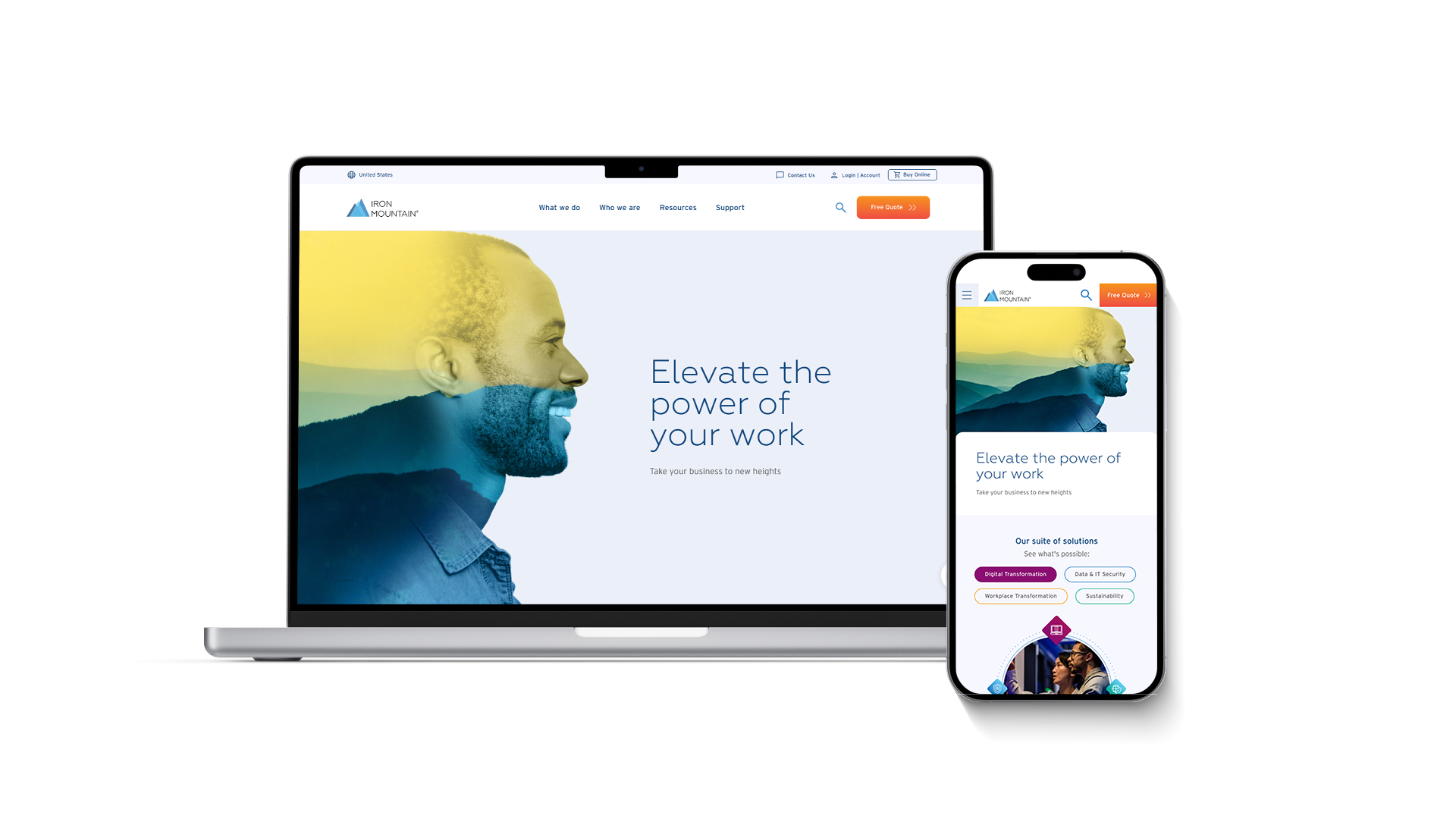
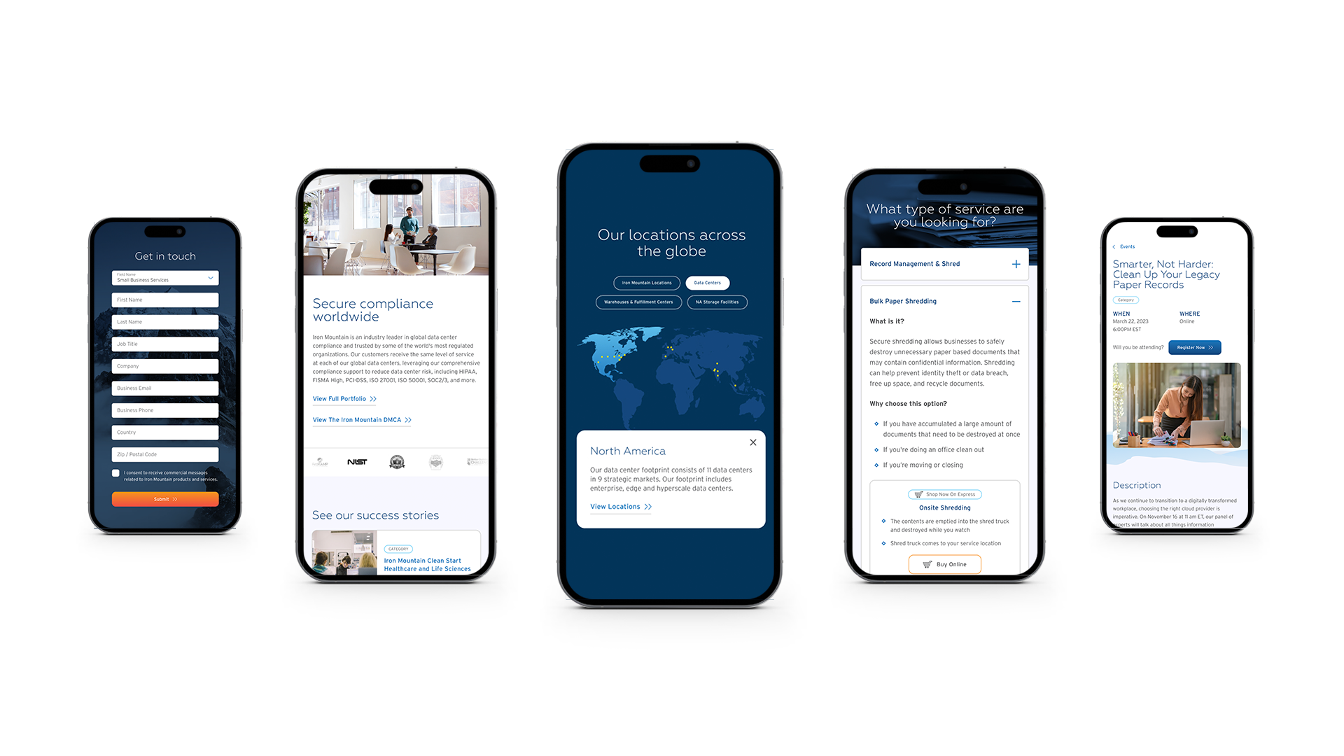
The process began with auditing the site to identify opportunities for streamlining and consolidation of both content and design elements and assets. Ultimately, Rightpoint developed a tight set of eleven highly flexible page templates and approximately fifty design components. This comprehensive design system was not only a much more elegant and digital-forward aesthetic, it was also designed to meet all the stated use cases such as being mobile responsive, adaptable to the varied needs of international sites, and able to perform on a variety of devices – all while providing better consistency and structure for the IRM content authoring team.
The site’s IA also got a complete overhaul. The old division of solutions versus services no longer represented a clear navigable path to Iron Mountain’s growing portfolio. After testing a few different approaches, the team settled on an IA that highlighted Iron Mountain’s enhanced transformational services – Asset Lifecycle Management, Data Centers, Digital Business, and Records & Information Management – balanced with featuring Iron Mountain’s incredible history. The Iron Mountain and Rightpoint teams conversed almost daily to ideate on concepts and directions, particularly around the presentation of the brand story.
Throughout the Create process, the teams focused on delivering a UX and design system that delivered consistency through simplicity. Each IA decision, template, and component was grounded in the goal of elevating the narrative by carefully constructing new opportunities to effectively frame all Iron Mountain’s incredible service content in a way that was consistent in terms of length, style, and overall presentation.
Working together, the Rightpoint and Iron Mountain teams were also able to navigate the mid-project integration of new branding elements into the site designs. The new branding was being developed in tandem with the site redesign, and the timing was so tight that the Rightpoint team could not afford to wait for the final brand elements before beginning their own design work. To accommodate this situation, Rightpoint developed an intelligent design system that was flexible and nimble enough to accept the new branding mid-stream without having to be re-engineered from ground zero.
At the end of the Create phase, the team had once again succeeded in delivering an impressive set of deliverables in near record time. These included an entirely new design system using Figma, which was created side-by-side in real-time collaboration with the Iron Mountain brand, marketing, and content entry teams; wireframes for eleven templates and more than 50 components to cover all use cases; content mapping guidelines; copywriting guidelines and playbooks; sitemaps for IA for the U.S., UK, and Australia sites; and new Sitecore implementation.
Leveraging the power of the Sitecore Experience Management platform, the development team took the upstream UX and Design work and brought it to life. Rightpoint and Iron Mountain developers leveraged a component-based architecture to assemble the page templates, giving equal emphasis to both the Content Authoring and end-user experience.

As a result of pairing Rightpoint’s expertise and experience with the phenomenally collaborative partnership of the Iron Mountain team, the new website exceeded expectations. Iron Mountain now has a web presence that does justice to both their long history and their forward-looking vision — a site that accurately represents the full range of their services, tells their organizational history, and speaks directly to prospective customers. In Q1 2024, there was increased content author efficiency for global content entry by reducing daily maintenance through country-centric language approach.
Insights
Research
Strategy
Content
Design
SEO
Engineering
Sitecore XM Architecture
Sitecore Experience Edge and Vercel
Sitecore Managed Cloud
Google Analytics 4
Google Tag Manager
Brightcove, Eloqua and Hubspot Integration

