Everything Developers and Designers Need to Know About Safari 15
Every year at WWDC, Apple announces new versions of their operating systems, apps, and services. Usually changes to Safari tend to be incremental, but this year, the browser is getting a significant update with version 15 - introducing a number of changes that impact anyone who designs, develops, or even uses websites on Safari.


As one of the world’s most widely used browsers, Safari is how more than 18% of users worldwide navigate the web on a daily basis. Making sure that sites not only work well but are optimized to take advantage of platform-specific features is important for delivering the best experience to those users.
A Brand-New Interface

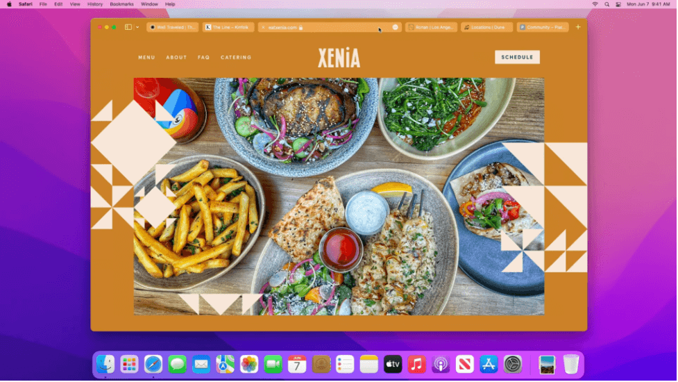
The first and most obvious UI change comes with Safari 15’s redesigned tab bar. On macOS and iPadOS all of the currently opened tabs and browser controls are now condensed onto a single line. The active tab now doubles as the URL field where the refresh, share, and bookmark buttons are also stashed away.
Because tabs are narrower, it’s now more important to have an easily identifiable favicon and title tag that concisely describes the content of the current page. When a user has many tabs open side-by-side, being able to quickly find the tab they’re looking for will eliminate a lot of frustration.
The addition of Tab Groups also offers a new way to create collections of tabs and sync them across devices. Other browsers such as Chrome have had similar tab grouping features for a while, but Safari’s main advantage is that Tab Groups not in use can be hidden away - saving precious visual real estate.

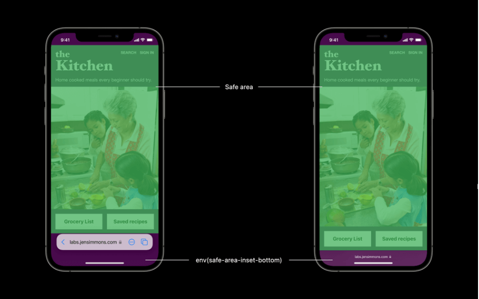
On iOS, the tab bar has been moved to the bottom of the screen, floating above the page’s content. While this makes the controls more reachable one-handed, it could obstruct fixed elements that are normally positioned towards the bottom of sites such as “back to top” buttons or other navigation.
In this case, CSS environment variables should be used to determine the “safe areas” on your page. Using these inset values to add margins or padding allows your content to adapt to shifts in viewport size caused by the browser’s UI. This can also be useful in determining offsets caused by hardware such as the iPhone’s sensor housing when in landscape mode.
Mobile safari is also getting a “pull-down to refresh” gesture, similar to many native apps like Instagram and Twitter. This helps to make interactions on the web feel even more app-like (especially when it comes to PWAs) by hiding more of the traditional browser UI.
Theme Color

The background color of the tab bar is no longer just white or grey, but instead adapts to the color scheme of the current page. This creates a more immersive user experience by giving the illusion that the site’s content extends to all four edges of the browser window.
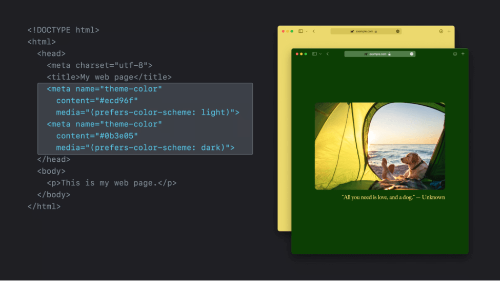
By default, this color is chosen by Safari automatically using the header or body element’s background-color but can also be set with the theme-color meta tag in the document head. The color used for the desktop tab bar also comes into play on iOS, being applied to the over-scroll and status bar areas.
Just like any other DOM node, JavaScript can be used to dynamically update the meta tag’s content attribute when a user takes certain actions. For example, when entering a gallery view a darker tab bar may be less distracting.
While most colors will work, there are exceptions for a narrow range of colors that could clash with the window’s close, minimize, and expand buttons. In these situations, Safari will default to a different color in order to preserve accessibility.
This version of Safari also adds support for the media attribute on meta tags, which can be used to specify separate tab bar colors for light and dark mode. Since not all browsers support the media attribute, the fallback meta tag for theme-color should be the one placed first.
Live Text

Images on the web are becoming more interactive in Safari 15 with the addition of Live Text. You can now highlight text directly from within an image and then copy, translate, or look up the selected text content.
Since this works by injecting text into the image’s shadow DOM, the text won’t be affected by JavaScript or be visible to the browser’s accessibility tree. Z-order can however still impact this functionality, so in most cases it’s recommended that elements with a higher z-index not be positioned over images.
Privacy
Apple has been taking a stronger stance on privacy recently, both on the web and its App Store. The company’s controversial introduction of App Tracking Transparency in iOS 14.5 made it harder for apps like Facebook to track users’ activity across apps. The new version of Safari takes privacy on the web a step further by adding a setting to hide your IP Address from advertisers and websites all together.
Safari also now supports automatic HTTPS upgrade, meaning users that visit an HTTP site that supports HTTPS will automatically be redirected to the more secure version.
Development
While changes to Web Inspector this year may not be as flashy as the rest of Safari, there are a handful of new features to improve the overall developer experience. Safari is following other browsers by adding CSS Grid overlays, making debugging grid layouts from the browser a bit easier. JavaScript debugging is becoming more powerful too with the addition of more configurable breakpoints and audit authoring.
In terms of WebKit, JavaScript has received new additions such as top-level await, class field syntax, and modules in workers. Support for a number of new CSS features have been added as well, including aspect-ratio, pseudo-element animations, and lab(), lch(), and hwb() color syntaxes.
For the first time ever browser extensions are making their way to iOS and iPadOS - opening the door for custom functionality like password managers, ad blockers, and more. Developers can use the WebExtension API to create cross-platform extensions that are compatible across Safari, Chrome, Firefox, and Edge. Users will be able to find and install these new extensions from the App Store.
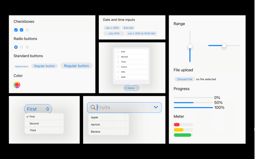
Styles for default form elements on iOS and iPadOS have also been completely redesigned to more closely match the appearance of system level controls. If these default user-agent styles haven’t been overridden in your CSS there may be some unexpected variation.

You can download the Safari Technology Preview on macOS Big Sur or later to try out some of these new features today. The final version will be available to everyone later this fall with the release of iOS 15, iPadOS 15, and macOS Monterey.
If you want your website to be ready to leverage all of these new features, reach out to the experts at Rightpoint today.


